
Schedule
The jam schedule has been updated
accordingly since participation in this particular jam.
Jam
This was my 4th time
competed in Ludum Dare since my first back in April 2013 (5 Days On 2 Days
Off). A total of 2064 games were
submitted and I managed to place rank #64
in the humour category which I was very pleased with. The theme for this Ludum
Dare was "You Only Get One”,
which I was fond of because I felt like it gave me enough room to experiment
and try new things. It was refreshing to work on something that felt quirky
while going through the testing phases of development.

The Game
Logline
- Channel is a game where players smash a characters face into a table and is
best described as a ‘Stress Relief Game’.
Player’s goal is to simply smash
a characters face repeatedly onto a table in order to obtain items. Channel was
my first ever attempt at an incremental/idle game. The theme ‘You Only Get One’
made me think of idle games. In a session with my lecturer Rob, he stated that
he “would like to see me create something
that was funny or comical”. So that was exactly what I try to do! Of
course, humour is subjective. What I find funny you might not, and vice versa.
But nonetheless, Channel fills me with amusement and it is cool watching people
hit character into the thousands!
Looking over Chapter 2 of the Game Jam Survival Guide it states some examples of
winning Ludum Dare entries. “The key
qualities that the top ten entries all had were: Humour; Simple Graphics; Simple
Gameplay; Easy to Pick up and Play”. (Kaitila,
2012) These four things were my main
key points that I wanted to strive to achieve, attempted to make something
humorous with simple two dimensional vector graphics in additional to super
simple gameplay mechanics.
What Went Well?
Gameplay Vision
I
spent some time deconstructing the experimental art game, AVGM (Abusive
Video Game Manipulation) by designers, Edmund
McMillen (Super Meat Boy) and Tyler Glaiel (Closure) found on Newgrounds.com – Created in 48 hours for The
Global Game Jam and winning entry for the 2010 Independent Games Festival award
for Innovation. To summarise, the game is a minimalist idle/incremental game
that explores some underlining satirical themes that are of the strong opinions
of the developers. One thing I particularly like about this game is its
stripped down mouse only clicking mechanic, something I have never prototyped
before which makes for new and exciting challenges to potentially overcome.
These particular types of game
are fairly new and often un-explored by developers so for me the genre was
exciting to prototype. Being excited about something will often show by itself
in the work that you do. One problem I frequently face that was in my trail of
thought is that my coding limitations often make it easy to overscope, I
approach design from a highly artistic point of view – particularly when
working alone. However, programming this type of game was very much in the
realm of possibility, so naturally, it felt like the right thing to do.

My initial vision gameplay vision came from merging two components, the first
being AVGM by Edmund McMillen & Tyler Glaiel - the second one being an old
experimental Flash animation of a naked character smashing their face into a
table, which I created in the 2nd year of my time at University.

Empathy
A pinnacle moment In the game
Black & White is that it allows players to slap their creature whenever you
like in order to discipline it into doing certain things – this was definitely
a big influence on the nature of my game that I tried to adopt in some way when
prototyping. I plan to do a new iteration of Channel that features free form
interaction with the character rather than limiting to on axis in order for
players to have full reign of their character – similarly to Black and White.

Palette Influences
I like to search for interesting
colour palettes in order to build up a little collection of wonderful
combinations of colour. I inkdrop directly from the poster of French film ‘Amelie’ by Jean-Pierre Juenet in order
collect some vibrant complimentary colours – I then use these colours as the
framework for my game idea.
The way I approached this jam
once the theme was revealed was by simply stating to myself, “I want to make a game with this colour
palette”. I literally copy the photo into flash and inkdrop directly from
the image to gather a range of complimentary colours that I intend to use for
my initial conception phase. A lot of the games I make stem from my favourite
films, music and artists – this one being a particularly good example.
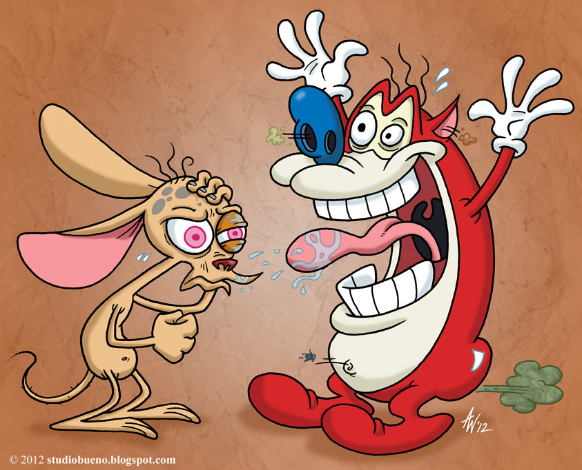
Animation Style
I am a big fan of The Ren and Stimpy Show, especially the
highly exaggerated, expressive over-the-top style and themes. I spent some time
looking over the elaborate hand-drawn storyboards used in the show to aid my
creative process. I pick out some things I like and begin sketching rough frame
by frame storyboards, compositions for objects and taking brief notes. One
thing I picked out that I particularly liked is the way characters eyes are
drawn across frames – something I was keen to recreate. Another aspect I like
was how collisions of characters into objects is expressed with such meticulous
nature – often by deforming, skewing, stretching or folding the mesh/skin of a
characters body into itself for short frame lengths.

The dramatic characterisation
complemented by a unique animation style is truly something to admire as a
stand out and definable cartoon. As designers it is important to look at the ‘greats’ in any creative or even
non-creative medium to learn and understand what it is that makes them established
in their field.
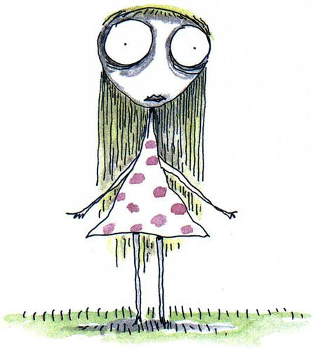
Visual Style
took out some visual style components from the book “The Melancholy Death of Oyster Boy by Tim Burton” to aid the characterisation
process. I like the way Burton uses lines and dark tones of colour under the
eyes, making his characters appear exhausted or ill - likewise with pale white
skin colour. Looking at these particular components help me through the process
of creating the character. Attention towards the eyes of your character will
allow you to control facial expressions and emotions more effectively. The character goes through a brief in-game art passes before the final prototype build is submitted. It is important to prioritise tasks alongside working quickly towards completing these tasks during a jam. Naturally, I attempt to spend more time on elements of the game that I predict will enhance the experience fruitfully – sometimes I can predict wrong. This can lead to flaws in many key areas.

Storyboarding
From the research made and
combining the components I like from different influences I began to map out
rough sketches of cool ideas for the game – of course, a lot of these do not
make it into the final game. I mapped out the general outline of the frame by
frame animations that I wanted to create for the core mechanic of the game.

Stress Relief
Experimentation
This experiment was aimed to
become a digital stress relief game, which I think would work well on a touch
screen mobile device. The reason the game is called ‘Channel’ is because I initially
intended players to channel stress into the game.

Non-Digital Prototyping –
Photography
After looking at the Ren &
Stimpy storyboards, I begin mocking up the basic outline for the animation
frames. Until I get a first art pass into a working digital prototype initially
I stick to the creation of only 3
frames for the key motion states of the characters face during play. The 1st
frame is an idle position facing straight upwards with frontal eye contact. The
2nd frame is a leaning forward in motion position with the top of
the head showing, arched shoulders and eye contact towards the desk. The 3rd
frame is the full impact showing the top of the back, and bottom of the neck –
this is where I intended to utilize the influence of Ren & Stimpy
storyboards of expressive/exaggerated character collisions.

The way I approached prototyping the key frames out before mocking up the visuals in Flash was to take photos of myself in the 3 key poses in order to obtain a rough visual aid for character form, framing, positioning, balance and composition. As odd as this may look, using photography was definitely an interesting and useful way of non-digital prototyping. It helped me get a sense of motion alongside establishing how the game would look long before the creation process had started. Shortly after these photos were taken I began coding in the core mechanic of the game.
Mechanics
“The genre of game that will win is ‘unique. Make something nobody has
ever seen before. Invent some weird mechanic that nobody is expecting. If it’s
a flop, all you have lost is 48 hours”. (Mike Hommel, 2012) I feel that I
nailed what Hommel mentions about creating some weird mechanic that no one is
expecting. But my true goal for this was initially for players to feel a sense
of empathy for the character whilst playing – I tried to do this with
positioning of eyebrows and facial expressions express multiple frames.
The mechanic pretty much came out how I envisioned it. One
thing that I am highly limited by is my technical ability to program so this
reflected the nature and scope of the game that I made drastically, which is
expected at a jam. I am almost happy with how the mechanic ‘feels’, it’s fairly
satisfying. I think one thing I wish I could’ve added was a custom cursor of a
hand to grab the character so that players obtain some visual feedback knowing
with clarity when they are interacting.

Sharing Work-In-Progress
“A really good motivational tool for game jammers is posting
screenshots of the work in progress. Sharing your work with others (fellow
Jammers, Twitter, your blog and so on) will generate feedback and
encouragement. Hearing what others think of what you have done so far can give
you the little push to keep you going” The example below shows my evidence
in sharing my very first playable build of Channel to the Ludum Dare community
on Twitter to put the idea of sharing work for motivation to practice.

Feel
Although the game is flawed in terms of control I am
actually relatively happy with the way that the way it feels – minus the
learning curve. I really wanted to create a sense of grabbing the character and
being able to physically throw him downwards with full force.

Addiction
I actively seek to create games
that seek to capture and engage the mind – games that make you desperately want
to keep playing. Addictiveness is the thing that keeps pulling players back to
the game in some cases this can lead to self-destructive patterns of play – Channel
is a reflection of self-destructive patterns of play and addictiveness. Admittedly,
if Channel were successful in being addictive in this prototype concrete
relevance would be more substantial. It was my intent when designing to further
develop my ability to keep players ‘hooked’ so that sense of not being able to
put the game down – just to see if I could. Most of my work arguably lacks in
terms of ‘fun’ or ‘addictiveness’, more simply something you play once and
forget about. I wanted to try to make a game that keeps players playing – it’s
something I never tried before. I have to say, this was ‘almost’ achieved – not
bad for a first attempt.
There are some things I could have done better to further
enhance the ‘addictive qualities’ of
the experience but I’ll talk about what these are later. Either way, some
players have been hooked up to 1,000 hits which is cool I guess, it means I was
somewhat successful in setting out what intended to set out – the game still
goes way beyond that however, only a few people have seen the last item which
is another reason why the design is flawed in many ways.
Iterative Design
What worked was I had a playable build and all my mechanics
in by the end of day one, which meant day two, was spent simply polishing and
tweaking the game. Initially I thought I had underscoped as I submitted and
stopped working on it about 6 hours early – I also slept over the weekend (a
lot). Over time I’ve realised that I could’ve spent the time adding things to
enhance this gameplay which at the time I was unable to come up – at that point
I was creatively drained. Below shows a couple of screenshots of how I iterated
the game over time:

Feedback
It has been important to absorb
some of the constructive feedback on
the game and to then act on that feedback – some people have some pretty solid suggestions.
One piece of feedback that I acted on which I was prompted to by my lecturer
was suggesting the game to feature Kongregate API leaderboards. I then
proceeded to spend a couple of hours figuring out how to get this implemented
in a build. The game tracks each face hit that players undertake, meaning I can
see with clarity the point at which players stop playing the game.

Getting positive feedback feels
great, this can be highly motivating and re-assuring in what you are crafting
is doing its job by pleasing players – because that is a designer’s job, right?
However, I try to take positive feedback with a pinch of salt because such
feedback can conflict with your ego and stump the growth in learning new things.
It is important to me personally to have a “beginners
mind” (Waitzkin, 2007) meaning treating every learning process as if I were
a child. Children have no worry towards being embarrassed of failure when
learning new things; they simply dive in and do it. As a designer it is also important to stay
humble and be self-critical towards your work, be aware of your weaknesses and
strengths and know that there is always going to be room for improvement.
What Went Wrong?
Theme
The only feedback that really
gets to me is when people say ‘I don’t understand how this links to the theme’.
Personally, I think people take the theme too seriously – a theme can inspire
design to go in ANY direction no matter how loosely interpreted. For me, it’s
interesting to see games where no clear link to the theme is defined – it makes
me wonder how the designer got to where they did and I think that’s much more interesting.
The way that this entry links to the theme is simply in the idea that you only
get one point per hit at a time.
Fundamental Design Flaws
Unfortunately having never designed an incremental game,
there is a ton of fundamental design flaws to be had, but that is okay! We can
solve all of these through ruthless iteration and on-going feedback. I was definitely surprised by the
rankings of Channel, “…almost every
single game that won was a platformer. It seems that people do not look as
highly upon shooters or highly experimental titles. It makes sense: people are
comfortable running and jumping. They like to explore.” (Kaitila, 2012)
Player Motivation
One of the flaws that became apparent through playtesting is
that it lacks player motivation, meaning that most players get bored after a
short period of time – it rapidly becomes un-interesting for players. This is
the one thing that incremental games are best at, hooking players in. So a huge
chunk of what idle games are defined by was very much lacking in Channel – but
simply being aware of this problem is the first step in beginning to overcome
it for next time.
A lot of time was devoted to visuals and art which was
arguably a mistake. I was hoping that by having nicely polished feeling visuals
that players would become hooked in through the repetition of manipulating
those visuals. Channel does not illustrate my ability to understand how
internal economies of idle games could work – which is something to work on
next time. I was very much in the mind-set of approaching idle game design from
a purely visual interactive point of view - which was definitely a big mistake.
Rewardables System
Another thing that acts as an additional catalyst for
lacking player motivation is that the reward system of items in Channel feels
meaningless, unimaginative and unintuitive – and they are.
The way the reward system is designed is as follows.
Players get items at the following number of hits - 2, 4, 8,
16, 24, 32, 48, 62, 82, 102, 118, 148, 182, 222, 264, 333, 412, 500, 666, 777,
888, 1000, 1500, 2000.
One way this system is flawed is that players do not know
when they are getting an item – making it feel too random. If you let players
simply know that they will get ‘something’
after ‘x’ amount of hits, that alone can be enough keep them hooked. You just
have to make sure that you keep players wanting that ‘something’ and that the
time spent achieving it was worthwhile with purpose. None of the rewards in
Channel have any real significance or purpose, they simply fill the screen/desk;
are static, cannot be interacted with and do not speed up the process of the
game in any way - all the more reason for players to stop playing the game.
Pacing
Often, idle games are ruthlessly fast paced and continue to
grow incrementally in pace the longer a players invest time into them.
Something that truly aids their addictive quality, making players feel like
progression is being made at a constant rapid rate. Channel does not utilize to
its advantage, the pacing always remains the same so nice feelings of
progression is lacking.
Main Menu
Watching my lecturer Dave play the game, he stated “how do I know when the game has started”.
This was arguably a silly mistake on my part as I could have found time to
implement a simple main menu. Although,
However, this did in fact cross my mind during the jam and the
reason for it was that I was trying to steer away from typical gaming
conventions, “silly I know!”
I imagined a player opening the game for the first time and
being thrown straight into the thick of it. I imagined them observing the
system, slowly figuring it out and then upon that first hit laughing about it
with some thoughts of shock from the goal of the game. Sometimes clunky UI and
menus sometimes create a detachment from the player to the game – which was
something I wanted to avoid due to my technical limitations. This was also an attempt
to give a sense of experimentation and discovery, I like the idea of players
figuring out what to do and laughing with it when they accomplish it. Looking
back it would have been beneficial to add a menu so that this flaw was then
avoided.
Controls
Having observed a plethora of playtesters, it was clear that
players pick up and play the game differently to how I initially intended –
which is a fundamental design flaw. It was a conscious decision to make the
interaction of the game a dragging motion. I wanted to make players feel as if
they were physically grabbing the character and forcing him into the desk.
Unlike most idle games they simply use clicks and I feel that dragging gives
players the freedom to be slightly more expressive in their motions as opposed
to simple mouse clicks.
How I Would Develop It Further
Flaws aside, I can see a lot of
potential in Channel. I commute by train a lot, one thing I often notice in
people whilst clutching a coffee in one hand, playing games in the other. I
would like to release a game that is geared towards this specific type of
person. I aim to target the game towards busy commuters travelling by train or
bus.
Conclusion/What I learnt?
This was hands down a very
successful Ludum Dare for me – I feel like I have developed a lot as a designer
because of this entry. Although Channel is fundamentally flawed in a number of
ways, I am nonetheless happy with it – or at the least some elements of it. I
like to define it to people as ‘a little
self-portrait game’, as odd as it may sound Channel feels very ‘me’ in a number of different ways. The
game being good or bad aside, I am strangely proud and fond of Channel - and I
can rarely say with ease I am proud of the things I create.
Fortunately, I scoped the game
well this time around. I learnt that forward moving gameplay is vital in
holding players focus, specifically when repetitious inputs into the game.
I plan to release a completely
re-designed version of Channel that hopefully resolves its fundamental flaws
for touch screen devices before the end of 2014 based on this original
prototype.

List of Illustrations
- Amelie [Poster] (2002) Available: http://www.wildeytheatre.com/CMS/uploads/amelie_001.jpg Last Accessed: 2013
- Art 1 (2004) Available: http://www.ljplus.ru/img4/l/y/lysergic_lady/5.jpg Last Accessed: 2013
- Art 2 (2004) Available: http://www.ljplus.ru/img4/l/y/lysergic_lady/6.jpg Last Accessed: 2013
- AVGM Interview (2012) Available: https://www.youtube.com/watch?v=p3bxzhiH374 Last Accessed: 2013
- Black & White (2013) Available: http://media.pcgamer.com/files/2013/07/PCG250-BlackWhite4.jpg Last Accessed: 2013
- Book Cover (2004) Available: https://encrypted-tbn2.gstatic.com/images?q=tbn:ANd9GcS9bUcHoTmm-ezt-Ncerw2betUoWaI0nmJXREZwMB-PHB9ACjug Last Accessed: 2013
- Girl 1 (2013) Available: http://37.media.tumblr.com/de02771fc87f648eafb0a48ac7832786/tumblr_mr3aqwnvxy1srrq2zo1_500.jpg Last Accessed: 2013
- Girl 2 (2013) Available: http://www.ljplus.ru/img4/l/y/lysergic_lady/_2.jpg Last Accessed: 2013
- Ren & Stimpy Storyboard 1 (2012) Available: http://fc03.deviantart.net/fs71/f/2012/157/5/d/eediot_by_studiobueno-d52k6zq.jpg Last Accessed: 2013
- Ren & Stimpy Storyboard 2 (2010) Available: https://blogger.googleusercontent.com/img/b/R29vZ2xl/AVvXsEhEMXpJ8cDToVhemHj_3_VQjpEgU4s1dG3RnJPaRc5-dXg0s2hFFzBO4XIjyhRILaKdRbJPJzhHctZYu2JKRiP7QSPp5w1gyG1Ds1juybVi1ybkmPipR9QpgFi-eBUQD24dO1QgMiyC9VY/s400/seq4_sc6_18.jpg Last Accessed: 2013
- Ren & Stimpy Storyboard 2 (2010) Available: https://blogger.googleusercontent.com/img/b/R29vZ2xl/AVvXsEhSWH66Cgjj2v_biBqnv-h5xcy9iIQ5FGD4208-cnUQtqfRX5XItNPt4QE9QKFymUuiYjDNYCihV9skhlhC0pm9fJDWKbgi9GYMhwNYpotrRqbBAr0a7-lODQ4N4FF8lx7hV89e2ungbAlj/s400/bhbrands.jpg Last Accessed: 2013
- Ren & Stimpy Storyboard 4 (2010) Available: http://artyougrewupwith.com/images/products/0000004161/large_0000004161.jpg Last Accessed: 2013
Bibliography
- Brathwaite B & Schreiber I (2009). Challenges for Games Designers - Non-digital Exercises for Video Game Designers. United States: Charles River Media. pg. 19 - 20.
- Burton, T (18 Nov 2004). The Melancholy Death of Oyster Boy: And Other Stories. United States: William Morrow and Company. NA.
- Kaitila, C (2012). The Game Jam Survival Guide. Canada: Packt Publishing. pg 10 - 73.
- Kaitila, C. (2012). How to Get the Most Out of a Game Jam. Available: http://gamedev.tutsplus.com/articles/business-articles/how-to-get-the-most-out-of-a-game-jam/. Last accessed October, 2013.
- McMillen, E. (2009). Opinion: Indie Game Design Do-s and Don't-s: A Manifesto. Available: http://www.gamasutra.com/view/news/26577/Opinion_Indie_Game_Design_Dos_and_Donts_A_Manifesto.php. Last accessed October, 2013.
- Garstang, I. (2013). The Over-scoping Game Designer – The Attack of the Feature Creep. Available: http://www.debugdesign.com/2013/01/12/the-over-scoping-game-designer-the-attack-of-the-feature-creep/. Last accessed October, 2013.
- Komppa, J. (2010). Sol's "rules" for surviving Ludum Dare 48h. Available: http://sol.gfxile.net/ldsurvival.html. Last accessed October, 2013.
- NA. (2014). NA. Available: http://www.kongregate.com/. Last accessed 2013.
- NA. (2002). NA. Available: http://www.ludumdare.com/. Last accessed 2013.
- Schell, J (2008). The Art of Games Design. FL: CRC Press. 4 - 450.
No comments:
Post a Comment